The Smoking Goat

You never know where your creative endeavors will take you, i.e. a commission for a wooden goat. The Smoking Goat restaurant, located in San Diego CA was doing a little design upgrade and they were looking for something to be placed in a nook just outside the lobby/entranceway of the restaurant.

Thanks to Anna at Radiant Design for setting it up and getting me the gig. A few pictures of the goat carved from alder wood, I layered a number of different stains on the wood starting with a whitewash and slowly working darker in the carved areas to a walnut finish. The bistro has a number of different copper accents and copper lighting so I used copper foil "hack" for the hooves and horns. The "hack" is a faux foil, using rice paper that I painted with Golden's Iridescent Copper, when dry cut or tear the paper into small squares. The squares look just like real foil and I attached them using Matte Medium again grom Golden.

If you get to North Park in San Diego check out the restaurant and the goat located at 3408 30th Street. Overall it measures about 36 inches tall and about 34 inches wide.

…and here is the goat installed at the front door to the restaurant, at home in his little niche guarding the mail and greeting customers.

…and here is the goat installed at the front door to the restaurant, at home in his little niche guarding the mail and greeting customers.

Fabric Tapestry Installation and Performance at SDMA

I was invited by Andrew Printer to create a “tapestry”  for the Summer Salon Series: Beyond the Banner at the San Diego Museum of Art as part of the Quilt Conversation in conjunction with the display of "The Invention of Glory: Afonso V and the Pastrana Tapestries." It was part of a multi-layered performance and visual art event that began in June and concluded on August 31, at the San Diego Museum of Art. 

The Quilt Conversation concluded a summer-long quilting project focused on the 1980’s with a multi-layered 30-minute finale. The finale being both a visual display of the various art quilts and tapestries and a performance that depicts/acts out the makings of the quilts/tapestries and the decade of Ronald Reagan, the fall of the Berlin Wall, and the emergence of AIDS and is historicised by a cast of contemporary dancers and improvisational actors as it was filtered through the summer’s quilt making and tapestry artists. The project is intended to reflect on the loose nature and the messy business of history making, as does the actual Pastrana Tapestry.

My tapestry is primarily created from red cotton fabric and sheer silk organza, it measures 72 inches long by 45 inches wide. The construction of the tapestry employed red cotton thread,  red silk thread, India Ink, black cotton thread, a digital photographic print on silk organza and red buttons and was hand sewn.

Detail of face area in progress 

Detail of face area in progress 

Another view of face in progress, I really like the way the real is seen behind the artificial (layering like history what is real with what we think happened), especially effective for its preformance aspect.

Another view of face in progress, I really like the way the real is seen behind the artificial (layering like history what is real with what we think happened), especially effective for its preformance aspect.

My individual tapestry attempts to depict the frailty of the body, memory and of history, in so much that history is all to often written by the victor and not the victims ( as is the case with the The Invention of Glory: Afonso V and the Pastrana Tapestries, it is written-woven by the victor not the victims).  In relationship to war our bodies become a constant battleground between us (the body) and the outside world of injuries, germs, bacteria, and viruses and that this battle intensifies with age. Also of concern here are those who attempt to record history and either unintentionally or intentionally reshape the history and thus the collective and individual memories of such events and in fact is what and how we do this same action with ourselves, in our own personal histories.

Detail of photograph (a digital print on silk-organza) sewn to fabric background.

Detail of photograph (a digital print on silk-organza) sewn to fabric background.

Detail of sewing and the organza pouch with red threads to represent strands of history.

Detail of sewing and the organza pouch with red threads to represent strands of history.

Detail showing buttons and additional sewing elements along with digital photographic print on the silk-organza.

Detail showing buttons and additional sewing elements along with digital photographic print on the silk-organza.

A Little History About The Pastrana Tapestries

The Pastrana Tapestries are among the finest surviving Gothic tapestries. The Invention of Glory: Afonso V and the Pastrana Tapestries will feature the recently restored set of four monumental tapestries that commemorate the deeds of Afonso V, King of Portugal.

Woven in the late 1400s, these monumental tapestries, each measuring 12 by 36 feet, depict Afonso V’s conquest in 1471 of the Moroccan cities of Asilah and Tangier, located near the entrance to the Strait of Gibraltar. They are among the rarest and earliest examples of tapestries created to celebrate what were then contemporary events, instead of allegorical or religious subjects. The designer minimized the misery of warfare, reinventing the event with the heroic image of Afonso and the ideals of chivalry in mind. Exquisitely rendered in wool and silk threads by Flemish weavers in Tournai, Belgium, the tapestries teem with vivid and colorful images of knights, ships, and military paraphernalia set against a backdrop of maritime and urban landscapes.

Since the 17th century the tapestries have been the property of the Collegiate Church of Our Lady of the Assumption in Pastrana, Spain, 50 miles east of Madrid. Because of their outstanding quality and historical significance, the Spanish government listed them as cultural patrimony to be safeguarded during the Spanish Civil War. Only one of the four tapestries has previously travelled to the U.S. The conservation of these tapestries received the European Union Prize for Cultural Heritage/Europa Nostra Awards 2011.

A view of the dance performance using the tapestry with the Pastrana Tapestry hanging on the wall in the background.

A view of the dance performance using the tapestry with the Pastrana Tapestry hanging on the wall in the background.

Another view of the dance performance in action.

Another view of the dance performance in action.

Part of the process was that we had to work in the museum during public hours to construct our work and engage with visitors.

Part of the process was that we had to work in the museum during public hours to construct our work and engage with visitors.

Working open to the public allowed us to interact with visitors creating a history as the object/tapestry was being created and then in some cases the visitors could return back and see the final performance and the individual work on display.

Working open to the public allowed us to interact with visitors creating a history as the object/tapestry was being created and then in some cases the visitors could return back and see the final performance and the individual work on display.

Monoprinting with OPEN Acrylics - Endless Exploration!

I wrote this article on Monoprinting with Golden's OPEN Acrylics for the Just Paint Newsletter, Issue # 32.

A variety of OPEN Acrylics are used to create an abstract image on a Gelli™ Plate by painting directly onto the plate in a painterly fashion. High Flow Turquois (Phthalo) was used to create the circles and spheres in the final image. You can al…

A variety of OPEN Acrylics are used to create an abstract image on a Gelli™ Plate by painting directly onto the plate in a painterly fashion. High Flow Turquois (Phthalo) was used to create the circles and spheres in the final image. You can also register your plate and pull a ghost print. With each successive print pulled, more and more paint is removed from the plate. Any number of objects can be used to create patterns and various types of textures. There are also plenty of tutorial videos online, each showing its own unique twist.

Monoprinting with OPEN Acrylics ‐ Endless Exploration!
A foray into printmaking using OPEN Acrylics as the primary printing ink and because the possibilities don’t stop there, a few experiments with High Flow Acrylics and QoR© Watercolors as inks. This foray is by no means comprehensive, but rather a journey of possibilities and experimentation.
By Kevin Greenland
GOLDEN Certified Working Artist

Our adventure begins with OPEN Acrylics as our “ink.” OPEN Acrylics are a line of professional artist acrylics with a uniquely slow-drying formulation. The increased working time of these colors expands their range to include more traditional techniques once only possible with oils. While the formulation is water-based, these paints do not act like any acrylic you may have tried before. Unlike standard acrylics, OPEN Acrylics have the ability to keep moving; they won’t quickly lock up or drag. Best in thin applications, OPEN Acrylics are ideal for glazing, shading, wet blending and subtractive techniques. The “stay wet” quality of OPEN makes it a perfect paint for printing techniques; thin layers stay wet longer.

With a longer working time, OPEN Acrylics are a perfect water-based option for printmaking and more comparable to oils in this application. The ease of soap and water cleanup eliminates some of the health and environmental concerns sometimes associated with oil-based inks for printmaking. Available in 80 colors, OPEN Acrylics can be used with either synthetic or natural fiber brushes and provides many more options beyond printing, but since their introduction they have found a unique niche as a Monotype printing ink.

Monotyping is a type of printmaking made by drawing or painting on a smooth, non-absorbent surface. The image created is then transferred onto a sheet of paper by pressing the two together, sometimes with the aid of a printing press. There are a number of non-absorbent matrices used to make monotypes and they certainly can be used with OPEN Acrylics. These include glass and/or plastic supports, but our focus here is mostly on Monotypes using the Gelli™ Plate. The gel printing plate is made of a unique plastic that contains mineral oil. The gel plate will leach a small amount of harmless mineral oil when left sitting on an absorbent surface; the plate is also latex free. To learn more visit www.gelliarts.com.

The monotype process requires that Monotypes can also be created by inking an entire surface and then using brushes or rags to remove ink, creating a subtractive image (i.e. creating lights from a field of opaque color). GOLDEN OPEN Acrylics are ideal for this subtractive process as the paint can stay “wet” for quite some time and is therefore, easily manipulated on the plate surface, Gelli Plate or otherwise.

In the past the inks used were oilbased and in more recent times, came the development of water-based inks. With oil-based inks, the paper may be dry, in which case the image has more contrast, or the paper may be damp, in which case the image has roughly a 10 percent greater range of tones.

Detail of a monotype pulled from a Gelli Plate.

Detail of a monotype pulled from a Gelli Plate.

These remain rather true using OPEN Acrylics as well. Dry printing gives the greater contrast. Using an atomizer to dampen the paper before printing with water gives the image a slightly greater range of tones and can vary to a more dreamy quality depending on the amount of water on the surface of the paper. Also for further consideration, try experimenting using OPEN Thinner to dampen the surface of the paper, which has a tendency to “wisp” out the finer lines, giving a certain kind of airy, dreamy quality to the print. While water is a common medium for reducing the viscosity of a standard acrylic paint, water works very aggressively with OPEN paints. Using OPEN Thinner is a better choice when a more fluid viscosity for this painterly approach is desired.

Mentioned before, Monotyping produces a unique print, a “monotype”, because most of the ink is removed during the initial pressing. Although subsequent reprints are sometimes possible, they differ greatly from the first print and are generally considered inferior. A second print from the original plate is called a “ghost print” or “cognate”. Stencils, watercolors, brushes, and other tools are often used to embellish a monotype. Monotypes are often spontaneously executed and with no preliminary sketch.

A detail of a Chine-colle©, combining the element of collage with printmaking using GOLDEN Soft Gel and OPEN Acrylics.

A detail of a Chine-colle©, combining the element of collage with printmaking using GOLDEN Soft Gel and OPEN Acrylics.

Monoprinting is a form of printmaking that uses a matrix such as a woodblock, litho stone, or copper plate, but produces multiple impressions that are unique. Multiple unique impressions printed from a single matrix are sometimes known as a variable edition (i.e. ten prints pulled from a zinc plate). There are many techniques used in monoprinting, including collographs and handpainted additions, and a form of tracing by which thick ink (OPEN Acrylics) is laid down on a plate or table and rolled out. Paper is then placed on the ink and the back of the paper is drawn on, transferring the ink to the paper. Traditional printmaking techniques such as lithography, woodcut, and intaglio, can be used to make monoprints.

Inking copper and zinc plates with OPEN Acrylics requires a little practice to perfect the wiping technique. On the left side of the image the final print is mounted to a wood panel using Soft Gel and then several thin coats of “acrylic encaustic” w…

Inking copper and zinc plates with OPEN Acrylics requires a little practice to perfect the wiping technique. On the left side of the image the final print is mounted to a wood panel using Soft Gel and then several thin coats of “acrylic encaustic” were added.

Monoprints can also be made by altering the type, color, and viscosity of the ink used to create different prints. Again, using OPEN Thinner in varying amounts with OPEN Acrylics can change the viscosity of the “inks”. In general, you will achieve a more ink-like substance if you permit the OPEN Acrylics to sit out for a full day in the studio before using them. I’ve found this stiffening process to be beneficial in achieving that desired ink-like consistency, but this is not necessary for Monotyping in the more painterly technique described in the previous paragraph.

Regarding inking the plates ‐ in some sense, not as much OPEN paint needs to be applied as with traditional inks. The old adage, “a little goes a long way,” applies here. In terms of wiping down the plates before printing, traditionally this is much like an intaglio wiping process, however you’ll need to adapt the wiping technique. Since OPEN Acrylics are water-based, they don’t react the same way to wiping as petroleum-based inks. The trick to printing here with a Monoprint style plate and OPEN paint is to combine intaglio-wiping methods with a more Monoprint approach. Traditional wiping is done with a tarlatan, a very absorbent cotton cloth, which is slightly too absorbent for OPEN, so it tends to wipe too much OPEN off the plate. Wrapping the tarlatan in a shell of tulle can solve this problem. The tulle is nylon netting and less absorbent than cotton tarlatan. Also the plastic nylon packaging for potatoes and onions works well as a shell, and then placing inside this nylon shell, a sheet of Brawny Dine- A-Cloth®. Try varying combinations to see what works best for you. Using these methods reduces the problem of wiping too much OPEN paint from the plate and this can also be used to your advantage by selectively drawing into the plate using cotton swabs and small daubers constructed from the Brawny Dine-A-Cloth.

As you can see, there is a tremendous amount of experimentation that can take place when creating both Monotypes and Monoprints. There are some water-based printmaking inks on the market today that use Gum Arabic as the base binder. With the introduction of GOLDEN QoR®Modern Watercolor using Aquazol® as a binder, I started to ponder the new potential of QoR as a printing ink. Think of the possibilities of working with OPEN alone on a Gelli Plate or in combination with QoR in any number of combinations of Monotype or Monoprint techniques. The possibilities for your journey into printmaking with GOLDEN’s contemporary materials are endless ‐ take the first step and twist off a cap to begin your adventure!

A Collograph print created from a textured bas-relief plate, constructed like a collage. The plate is “inked” with OPEN Acrylics and the image is transferred to paper with the aid of a hand baren.

A Collograph print created from a textured bas-relief plate, constructed like a collage. The plate is “inked” with OPEN Acrylics and the image is transferred to paper with the aid of a hand baren.

Normal
0


false
false
false

EN-US
JA
X-NONE


<w:LatentStyles DefLockedState="false" DefUnhideWhenUsed="true"
DefSemiHidden="true" DefQFormat="false" DefPriority="99"
LatentStyleCount="276">
<w:LsdE…

This is a 3 step or 3-color print from a Gelli Plate. The first layer was the yellow, then a stencil with the red, then the birds as the last layer. This is the first pull or print, below is the second pull or ghost print. The ghost print is usually a little lighter in color because it’s only picking the remaining paint after the 1st pull rather than re-inking.

To find out more about Golden products visit their website: GoldenPaints.com

You can subscribe to the newsletter Just Paint by following this link, Just Paint is published by Golden Artist Colors, Inc.

To find a listing of my classes & workshops visit my Calendar Page here or jump to my Working Artist page on Golden’s website: Kevin Greeland

What is Psychogeography?

Normal
0


false
false
false

EN-US
JA
X-NONE


 <w:LatentStyles DefLockedState="false" DefUnhideWhenUsed="true"
DefSemiHidden="true" DefQFormat="false" DefPriority="99"
LatentStyleCount="276">…

Psychogeography was defined in 1955 by Guy Debord as “the study of the precise laws and specific effects of the geographical environment, consciously organized or not, on the emotions and behavior of individuals.” [1] Another definition is “a whole toy box full of playful, inventive strategies for exploring cities…just about anything that takes pedestrians off their predictable paths and jolts them into a new awareness of the urban landscape.” [2]

 References

1. Introduction to a Critique of Urban Geography, 1955

2. http://www.utne.com/pub/2004_124/promo/11262-1.html Joseph Hart, “A New Way of Walking,” Utne Reader July/August 2004

Normal
0


false
false
false

EN-US
JA
X-NONE


 <w:LatentStyles DefLockedState="false" DefUnhideWhenUsed="true"
DefSemiHidden="true" DefQFormat="false" DefPriority="99"
LatentStyleCount="276">…

Psychogeography was originally developed by the avant-garde movement Lettrist International in the journal Potlach. The originator of what became known as unitary urbanism, psychogeography, and the dérive was Ivan Chtcheglov, in his highly influential 1953 essay “Formulaire pour un urbanisme nouveau” (“Formulary for a New Urbanism”). [3] The Lettrists’ reimagining of the city has its precursors in aspects of Dadism and Surrealism. The idea of urban wandering relates to the older concept of the flâneur, theorized by Charles Baudelaire. Following Chtcheglov’s exclusion from the Lettrists in 1954, Guy Debord and others worked to clarify the concept of unitary urbanism, in a bid to demand a revolutionary approach to architecture. At a conference in Coscio de Arroscia, Italy in 1956, the Lettrists joined the International Movement for an Imaginist Bauhaus to set a proper definition for the idea announced by Gil J. Wolman “Unitary Urbanism – the synthesis of art and technology that we call for — must be constructed according to certain new values of life, values which now need to be distinguished and disseminated.” [4] It demanded the rejection of functional, Euclidean values in architecture, as well as the separation between art and its surroundings. The implication of combining these two negations is that by creating abstraction, one creates art, which, in turn, creates a point of distinction that unitary urbanism insists must be nullified. This confusion is also fundamental to the execution of unitary urbanism as it corrupts one’s ability to identify where “function” ends and “play” (the “ludic”) begins, resulting in what the Lettrist International and Situationist International believed to be a utopia where one was constantly exploring, free of determining factors.

In “Formulary for a New Urbanism,” Chtcheglov had written, “Architecture is the simplest means of articulating time and space, of modulating reality, of engendering dreams.” [5] Similarly, the Situationists found contemporary architecture both physically and ideologically restrictive, combining with outside cultural influence, effectively creating an undertow, and forcing oneself into a certain system of interaction with their environment:

“Cities have a psychogeographical relief, with constant currents, fixed points and vortexes which strongly discourage entry into or exit from certain zones.” [6]

Normal
0


false
false
false

EN-US
JA
X-NONE


 <w:LatentStyles DefLockedState="false" DefUnhideWhenUsed="true"
DefSemiHidden="true" DefQFormat="false" DefPriority="99"
LatentStyleCount="276">…

The Situationists’ response was to create designs of new urbanized space, promising better opportunities for experimenting through mundane expression. Their intentions remained completely as abstractions. Guy Debord’s truest intention was to unify two different factors of “ambiance” that, he felt, determined the values of the urban landscape: the soft ambiance – light, sound, time, the association of ideas – with the hard, the actual physical constructions. Debord’s vision was a combination of the two realms of opposing ambiance, where the play of the soft ambiance was actively considered in the rendering of the hard. The new space creates a possibility for activity not formerly determined by one besides the individual.

However, the Situationist International may have been tongue-in-cheek about some parts of Psychogeography. “This apparently serious term ‘Psychogeography,'” writes Debords’ biographer Vincent Kaufman, “comprises an art of conversation and drunkenness, and everything leads us to believe that Debord excelled at both.” [7]

Eventually, Debord and Asger Jorn resigned themselves to the fate of “urban relativity”. Debord readily admits in his film A Critique of Separation (1961), “The sectors of a city…are decipherable, but the personal meaning they have for us is incommunicable, as is the secrecy of private life in general, regarding which we possess nothing but pitiful documents”. Despite the ambiguity of the theory, Debord committed himself firmly to its practical basis in reality, even as he later confesses, none of this is very clear. It is a completely typical drunken monologue…with its vain phrases that do not await response and its overbearing explanations, and its silences. A Critique of Separation (1961). Complete Cinematic Works, AK Press, 2003, Trans. Knabb.

Before settling on the impossibility of true Psychogeography, Debord made another film, On the Passage of a Few Persons Through a Rather Brief Unity of Time (1959), the title of which suggests its own subject matter. The film’s narrated content concerns itself with the evolution of a generally passive group of unnamed people into a fully aware, anarchistic assemblage, and might be perceived as a biography of the Situationists themselves. Among the rants which construct the film (regarding art, ignorance, consumerism, militarism) is a desperate call for Psychogeographic action:

“When freedom is practiced in a closed circle, it fades into a dream, becomes a mere image of itself. The ambiance of play is by nature unstable. At any moment, “ordinary life” may prevail once again. The geographical limitation of play is even more striking than its temporal limitation. Every game takes place within the boundaries of its own spatial domain.”

Moments later, Debord elaborates on the important goals of unitary urbanism in contemporary society:

“The atmosphere of a few places gave us a few intimations of the future powers of an architecture that it would be necessary to create in order to provide the setting for less mediocre games.”

Quoting Marx, Debord says:

“People can see nothing around them that is not their own image; everything speaks to them of themselves. Their very landscape is animated. Obstacles were everywhere. And they were all interrelated, maintaining a unified reign of poverty.”

While a reading of the texts included in the journal Internationale Situationniste may lead to an understanding of Psychogeography as dictated by Guy Debord, a more comprehensive elucidation of the term would come from research into those who have put its techniques into a more developed practice. While Debord’s influence in bringing Chtchglov’s text to an international audience is undoubted, his ability to practice the ‘praxis’ of unitary urbanism has been placed into question by almost all of the subsequent protagonists of the Formulary’s directives. Debord was indeed a notorious drunk (see his Panegyrique, Gallimard 1995), and his assertions regarding the veracity of the affects of the psychogeographical process (derive, constructed situation) must be questioned by this personal weakness. The researches undertaken by WNLA, AAA and the London Psychogeographical Association during the 1990’s support the contention of Asger Jorn and the Scandinavian Situationniste (Drakagygett 1962 – 1998) that the psychogeographical is a concept only known through practice of its techniques. Without undertaking the program expounded by Chtchglov, and the resultant submission to the urban unknown, comprehension of the Formulary is not possible. As Debord himself suggested, an understanding of the ‘beautiful language’ of situationist urbanism necessitates its practice. For those who wish to understand both the consequences and outcomes of psychogeographical research, exploration of the outcomes of its protagonists is strongly advised.

Dérive as a Term

I’ll expand more on this later (scroll down after this article for an additional article), but in general…

...by definition, psychogeography combines subjective and objective knowledge and studies. Debord struggled to stipulate the finer points of this theoretical paradox, ultimately producing “Theory of the Dérive” in 1958, a document that essentially serves as an instruction manual for the psychogeographic procedure, executed through the act of dérive (“drift”).

“In a dérive one or more persons during a certain period drop their usual motives for movement and action, their relations, their work and leisure activities, and let themselves be drawn by the attractions of the terrain and the encounters they find there… But the dérive includes both this letting go and its necessary contradiction: the domination of psychogeographical variations by the knowledge and calculation of their possibilities.” [6]

In the SI’s 6th issue, Raoul Vaneigem writes in a manifesto of unitary urbanism,

“All space is occupied by the enemy. We are living under a permanent curfew. Not just the cops – the geometry.” [8] Dérive, as a previously conceptualized tactic in the French military, was “a calculated action determined by the absence of a greater locus”, and “a maneuver within the enemy’s field of vision.” [9]

To the SI, whose interest was inhabited space, the dérive brought appeal in this sense of taking the “fight” to the streets and truly indulging in a determined operation. The dérive was a course of preparation, reconnaissance, a means of shaping situationist psychology among urban explorers for the eventuality of the situationist city.

Normal
0


false
false
false

EN-US
JA
X-NONE


 <w:LatentStyles DefLockedState="false" DefUnhideWhenUsed="true"
DefSemiHidden="true" DefQFormat="false" DefPriority="99"
LatentStyleCount="276">…

AMD Map 1, Print on Somerset paper, 2009. Kevin Greeland.

Psychogeography in the Contemporary World

Since the 1990’s, as situationist theory became popular in artistic and academic circles, avant-garde, neoist and revolutionary groups emerged, developing psychogeographical praxis in various ways. Influenced primarily through the re-emergence of the London Psychogeographical Association and the foundation of The Workshop for Non-Linear Architecture, these groups have assisted in the development of a contemporary psychogeography.

Between 1992 and 1996 The Workshop for Non-Linear Architecture undertook an extensive program of practical research into classic (situationist) psychogeography in both Glasgow and London. The discoveries made during this period, documented in the group’s journal Viscosity, expanded the terrain of the psychogeographic into that of urban design and architectural performance.

The Journal Transgressions: A Journal of Urban Exploration (which appears to have ceased publication sometime in 2000) collated and developed a number of post-avant-garde revolutionary psychogeographical themes. The journal also contributed to the use and development of psychogeographical maps [10] which have, since 2000 been used in political actions, drifts and projections, distributed as flyers. Since 2003 in the United States, separate events known as Provflux and Psy-Geo-conflux have been dedicated to action-based participatory experiments, under the academic umbrella of psychogeography.

Psychogeography also become a device used in performance art and literature. In Britain in particular, psychogeography has become a recognized descriptive term used in discussion of successful writers such as Iain Sinclair and Peter Ackroyd and the documentaries of filmmaker Patrick Keiller. The popularity of Sinclair drew the term into greater public use in the United Kingdom. Though Sinclair makes infrequent use of the jargon associated with the Situationists, he has certainly popularized the term by producing a large body of work based on pedestrian exploration of the urban and suburban landscape. Sinclair and similar thinkers draw on a longstanding British literary tradition of the exploration of urban landscapes, predating the Situationists, found in the work of writers like William Blake, Arthur Machen, and Thomas de Quincey. The nature and history of London were a central focus of these writers, utilizing romantic, gothic, and occult ideas to describe and transform the city. Sinclair drew on this tradition combined with his own explorations as a way of criticizing modern developments of urban space in such key texts as Lights Out for the Territory. Peter Ackroyd’s bestselling London: A Biography was partially based on similar sources. Merlin Coverley gives equal prominence to this literary tradition alongside Situationism in his book Psychogeography (2006), not only recognizing that the situationist origins of psychogeography are sometimes forgotten, but that via certain writers like Edgar Allan Poe, Daniel Defoe and Charles Baudelaire they had a shared tradition. Psychogeography, as a term and a concept, now reaches more British eyes than ever before, as novelist Will Self had a column of that name which started out in the British Airways Inflight magazine and then appeared weekly in the Saturday magazine of The Independent newspaper until October 2008.

The concepts and themes seen in popular comics writers such as Alan Moore in works like From Hell are also now seen as significant works of psychogeography. Other key figures in this version of the idea are Walter Benjamin, J. G. Ballard, and Nicholas Hawksmoor. Part of this development saw increasing use of ideas and terminology by some psychogeographers from Fortean and occult areas like earth mysteries, ley lines, and chaos magic, a course pioneered by Sinclair. A core element in virtually all these developments remains a dissatisfaction with the nature and design of the modern environment and a desire to make the everyday world more interesting.

After a few years of practicing, the psychogeography group that gravitates around the Urban Squares Initiative and Aleksandar Janicijevic, [11] [12] the initiator of, and main figure in organizing and leading this group, came up with the working definition of this procedure as: “The subjective analysis–mental reaction, to neighborhood behaviors related to geographic location. A chronological process based on the order of appearance of observed topics, with the time delayed inclusion of other relevant instances.” [13] Bill Humber [Executive Director, Revitalization Institute, Toronto, Canada], [14] [15] a participant in a few of our walks, described our intentions in his article about psychogeography like this:

“In discovering a small world we discover the whole world.” [16]

 References

1. Introduction to a Critique of Urban Geography, 1955

2. http://www.utne.com/pub/2004_124/promo/11262-1.html Joseph Hart, “A New Way of Walking,” Utne Reader July/August 2004

3. Ivan Chtcheglov, Formulary for a New Urbanism, Full text at bopsecrets.org

4. Wolman G. (1956) Address by the Lettrist International Delegate to the Alba Conference of September 1956 Alba: Lettrist International

5. Ivan Chtcheglov, Formulary for a New Urbanism, 1953

6. Knabb, Ken, ed. Situationist International Anthology, Berkley: Bureau of Public Secrets, 1995. p. 50.

7. Kaufman, Vincent, Guy Debord: Revolution in the Service of Poetry, Minneapolis: University of Minnesota Press, 2006, p. 114.

8. Gray, Christopher, editor, Leaving the 20th Century: the Incomplete Work of the Situationist International, London: Rebel P, 1998. p. 26.

9. McDonough, Tom, ed. Guy Debord and the Situationist International: Texts and Documents, Boston: October Press, 2004. p. 259.

10. “The production of psychogeographical maps, or even the introduction of alterations such as more or less arbitrarily transposing maps of two different regions, can contribute to clarifying certain wanderings that express not subordination to randomness but total insubordination to habitual influences (influences generally categorized as tourism, that popular drug as repugnant as sports or buying on credit).” from Introduction to a Critique of Urban Geography, Debord 55

11.  [1]

12. [2]

13. [3]

14. [4]

15. [5]

16. Specific Aspect of Psychogeography – Psychographs. Urbansquare

Initiative, Aleksandar Janicijevic.

 *Kaufman, Vincent. Guy Debord: Revolution in the Service of Poetry. (Minneapolis: University of Minnesota Press, 2006).

 *Knabb, Ken (editor) Situationist International Anthology. (Berkley: Bureau of Public Secrets, 1995).

 *McDonough, Tom (editor) Guy Debord and the Situationist International: Texts and Documents. (Boston: October P, 2004).

More About Dérive

In psychogeography, a dérive is an unplanned journey through a landscape, usually urban, on which the subtle aesthetic contours of the surrounding architecture and geography subconsciously direct the travellers, with the ultimate goal of encountering an entirely new and authentic experience. Situationist theorist Guy Debord defines the dérive as “a mode of experimental behavior linked to the conditions of urban society: a technique of rapid passage through varied ambiances.” He also notes “the term also designates a specific uninterrupted period of dériving.” [1] The term is literally translated into English as drift.

The concept of the dérive has its origins in the Letterist International of the 1940s, an artistic and political collective based in Paris, where it was a critical tool for understanding and developing the theory of psychogeography, defined as the “specific effects of the geographical environment (whether consciously organized or not) on the emotions and behavior of individuals.”[1] The dérive, an unplanned tour through an urban landscape directed entirely by the feelings evoked in the individual by their surroundings, served as the primary means for mapping and investigating the psychogeography of these different areas.

The dérive continued to be a critical concept in the theory of the Situationist International, the radical group of avant-garde artists and political theorists that succeeded the Letterist International, emerging in the 1950s. For the Situationists, the dérive is the primary technique for exploring an urban landscape’s psychogeography and engaging in new experiences. According to situationist theorist Guy Debord, in performing a dérive, the individual in question must first set aside all work and leisure activities and all their other usual motives for movement and action, and let themselves be drawn by the attractions of the terrain and the encounters they find there.

The need for the dérive is necessitated, according to situationist theory, by the increasingly predictable and monotonous experience of everyday life trudged through every day by workers in advanced capitalism. [2] The dérive grants a rare instance of pure chance, an opportunity for an utterly new and authentic experience of the different atmospheres and feelings generated by the urban landscape. [2] Debord observes in his Introduction to a Critique of Urban Geography:

The sudden change of ambiance in a street within the space of a few meters; the evident division of a city into zones of distinct psychic atmospheres; the path of least resistance that is automatically followed in aimless strolls (and which has no relation to the physical contour of the terrain); the appealing or repelling character of certain places — these phenomena all seem to be neglected. In any case they are never envisaged as depending on causes that can be uncovered by careful analysis and turned to account.

—Guy Debord, Introduction to a Critique of Urban Geography [3]

Several groups have adopted the concept of the dérive and applied it in their own form, including many modern organizations, most notably the London Psychogeographical Association and the Providence Initiative for Psychogeographic Studies. Since 2003 in the United States, separate events known as Provflux and Psy-Geo-conflux have been dedicated to action-based participatory experiments similar to the dérive, within the context of psychogeography.

 References

1. Guy Debord (1958) Definitions. Internationale Situationniste #1 (Paris, June 1958). Translated by Ken Knabb.

2. Guy Debord (1956) Theory of the Dérive. Les Lèvres Nues #9 (Paris, November 1956). Reprinted in Internationale Situationniste #2 (Paris, December 1958). Translated by Ken Knabb.

3. Guy Debord (1955) Introduction to a Critique of Urban Geography. Les Lèvres Nues #6 (Paris, September 1955). Translated by Ken Knabb.


Cities are Sites of Mystery


Normal
0


false
false
false

EN-US
JA
X-NONE


 <w:LatentStyles DefLockedState="false" DefUnhideWhenUsed="true"
DefSemiHidden="true" DefQFormat="false" DefPriority="99"
LatentStyleCount="276">…

Cities are sites of mystery, and psychogeography seeks to reveal the true nature that lies beneath the flux of the everyday.


Normal
0


false
false
false

EN-US
JA
X-NONE


 <w:LatentStyles DefLockedState="false" DefUnhideWhenUsed="true"
DefSemiHidden="true" DefQFormat="false" DefPriority="99"
LatentStyleCount="276">…

Childhood Psychogeography Maps


Normal
0


false
false
false

EN-US
JA
X-NONE


 <w:LatentStyles DefLockedState="false" DefUnhideWhenUsed="true"
DefSemiHidden="true" DefQFormat="false" DefPriority="99"
LatentStyleCount="276">…

Two maps from my childhood, maybe created around 1976 or 1978, they are all that remain from a larger collection. Many of the maps were drawn in pen & ink, colored pencil or maker over existing maps from various AAA travel guides picked up at flea markets or local tag sales, thankfully my parents were willing to spend 50 cents or a dollar at the time on a used travel atlas–those were the days. For the most part the maps depict settlements and military strategies and various types of encampments. I originally had maybe 25+ or so of this style of map. Most I saved but over time the folder/box they were housed in got lost in the numerous moves. And of course at the time, I knew nothing about Psychogeography or that I’d want to save my maps for posterity and further research into the efforts of map-making. Today I imagine it might play out differently— parents might be horrified if they found their kids taking a crayon to the iPad and drawing on top of goggle maps.


GOLDEN Crackle Paste

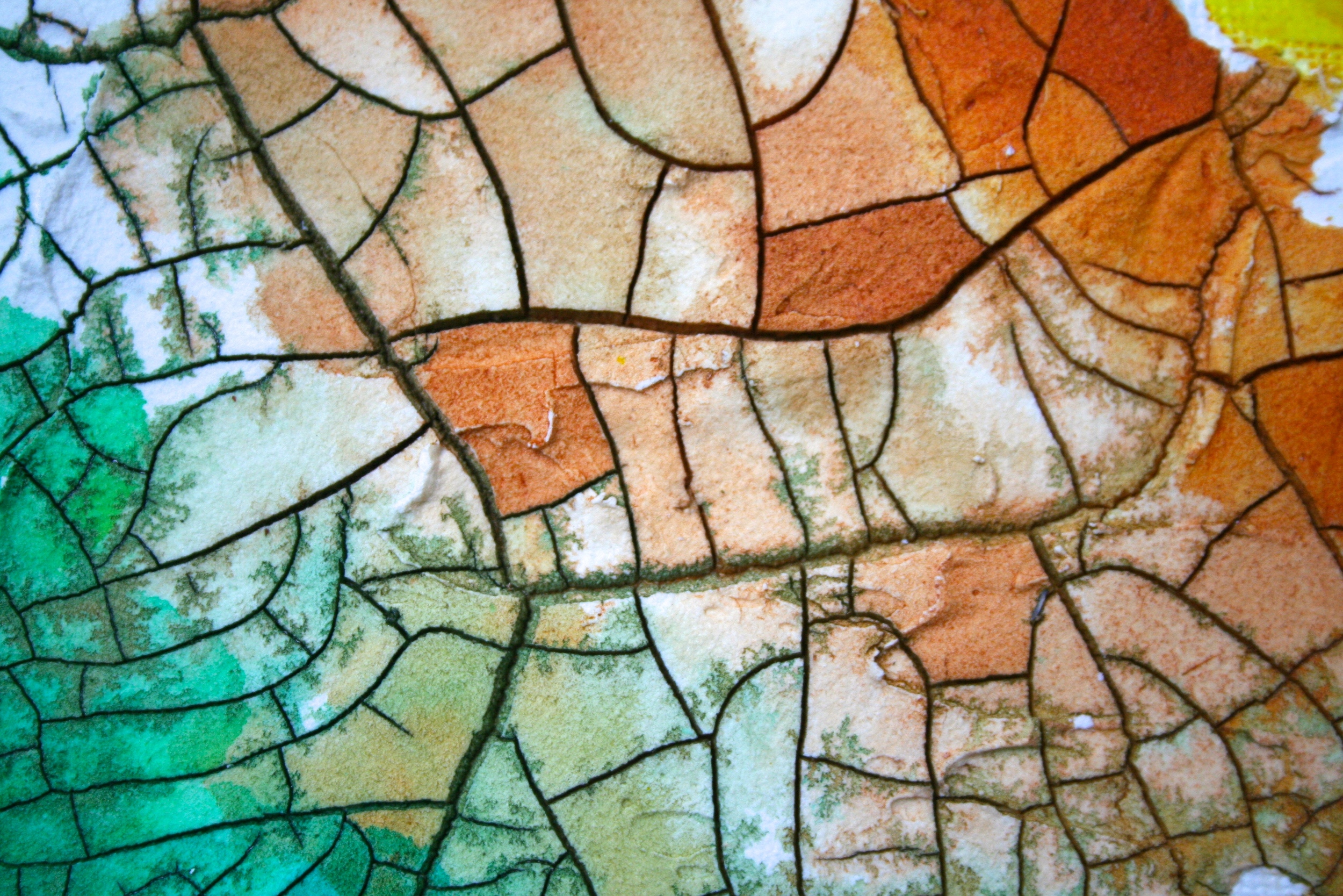
GOLDEN Crackle Paste is a thick, opaque cracking material, designed to develop deep fissure-like cracks as it cures. The size and extent of the crackle pattern is dependent on many factors, including the thickness of application, and the environmental conditions (temperature, relative humidity and air flow) during drying.

Golden Crackle Paste has a consistency similar to cake icing, easily manipulated by a palette knife. Peaks will maintain their height and appearance. It is a harder film than the GOLDEN Light Molding Paste, yet still retains an absorbent surface. Films dry to an opaque, matte finish to which subsequent layers of acrylic paint and mediums can be applied. Crackle Paste can be easily tinted with GOLDEN Heavy Body, Matte, High Load and Fluid Acrylic Paints.

APPLICATION INFORMATION

While it’s possible to apply Crackle Paste onto a wide variety of surfaces, the extreme shrinking can warp flexible products like paper or canvas. Therefore, applications onto rigid supports such as wooden panels, sheetrock (decorative/faux finish applications) or hardboard are recommended. If an application on canvas is desired, pre-stretch the canvas before applying the Crackle Paste. This minimizes the warping of the canvas during drying. If paper is the desired substrate, it may be glued to a rigid support with an acrylic medium [such as Soft Gel (Gloss)] and allowed to dry to before applying the Crackle Paste. By securing the substrate or using a rigid support, the Crackle Paste has the greatest opportunity to develop the best possible pattern.

Inflexible Support — Shows how canvas will warp if this product is applied.

Inflexible Support — Shows how canvas will warp if this product is applied.

Below are a few student examples using Crackle Paste, the sgraffito pear was created by drawing directly into the wet paste, then allowing for it to dry, painting with thin washes of Golden Fluid Acrylics.

On the above panel the crackle paste has been spread out using a palette knife. The thickness is about that of a coin. The panel background was painted yellow to highlight the cracked areas. Generally the thicker the product the larger the cracks an…

On the above panel the crackle paste has been spread out using a palette knife. The thickness is about that of a coin. The panel background was painted yellow to highlight the cracked areas. Generally the thicker the product the larger the cracks and the thinner the paste the smaller  the cracks. You can use a variety of tools to apply the product to a number of different surfaces, a rigid surface is the best.

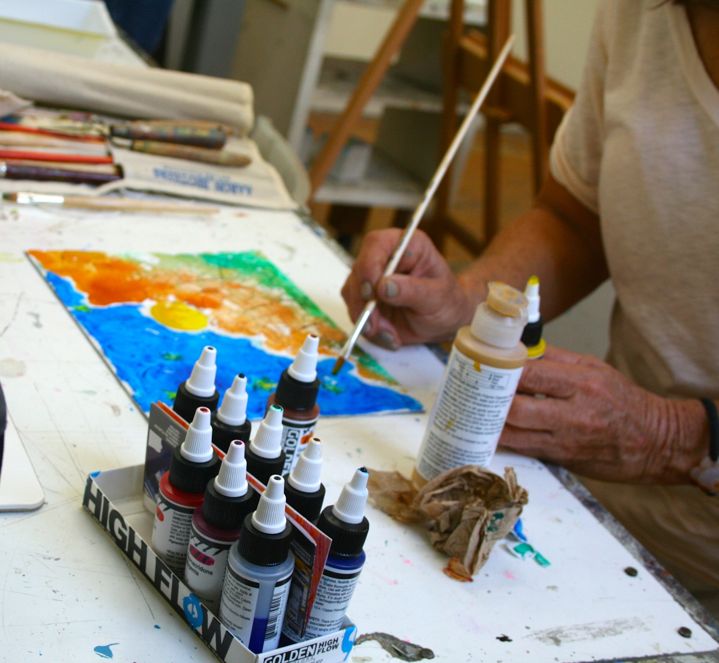
Here I’m demonstrating to students the application of crackle paste and how to achieve different looks.

Here I’m demonstrating to students the application of crackle paste and how to achieve different looks.

On this panel I used QoR Watercolors by Golden to paint the surface of the crackle paste, the surface is fairly absorbent and can create a number of different effects when using water to flood the surface.

On this panel I used QoR Watercolors by Golden to paint the surface of the crackle paste, the surface is fairly absorbent and can create a number of different effects when using water to flood the surface.

You can also use Fluid Acrylics and High Flow Acrylics on Crackle Paste. You can apply multiple, thin, watercolor-like layers of fluid acrylics or thicker applications of paint. The more paint you apply and the more successive layers the more you can reduce the absorption of the Crackle Paste.  And if you use traditional heavy body paints you can even begin to fill in some of the cracks and smaller fissures.

On the panel below we used the Iridescent Bronze (Fine), one of the cool things about Golden’s Iridescent Bronze is the effects you can achieve when you flood it with water and the Phthalo Green pigment starts to separate out.

Crackle paste can be used to create traditional landscape paintings or abstract work, and as it dries you can allow the shapes in the paste to dictate what it is to become or the individual cells (mosaics). The Crackle Paste can be painted like a mosaic.

Notice how the paint is wicked from one cell to the next driven by the waters capillary action.

Notice how the paint is wicked from one cell to the next driven by the waters capillary action.

Here a student is using both Fluid and High Flow Acrylics by Golden to create her landscape painting.

Here a student is using both Fluid and High Flow Acrylics by Golden to create her landscape painting.

Below are a few sample boards created for a lesson I  do on Crackle Paste in my mixed media painting class. The idea came from a book titled “rethinking acrylic” written by Patti Brady. The image is based on a similar work created by Golden working Artist  Bonnie Cutts (page 39 in the book “rethinking acrylics”). It's a fun and fairly easy lesson that students really enjoy.

A quick how to: 1) apply Crackle Paste, allow to dry, 2) Apply paint in thin watery washes, and step 3) repeat until happy.

A quick how to: 1) apply Crackle Paste, allow to dry, 2) Apply paint in thin watery washes, and step 3) repeat until happy.

First layer of paint, you could use Fluid Acrylics, High Flow Acrylics or QoR Watercolors all made by Golden. Just remember to keep them juicy wet with water to take advantage of the absorbent nature of the Crackle Paste.

First layer of paint, you could use Fluid Acrylics, High Flow Acrylics or QoR Watercolors all made by Golden. Just remember to keep them juicy wet with water to take advantage of the absorbent nature of the Crackle Paste.

Building up the "wash" layers of paint to add interest.&nbsp;

Building up the "wash" layers of paint to add interest. 

There’s nothing like a few candid photos of yourself while teaching to make you look a little goofy and a little crazy, but aren’t most artist supposed to be a little goofy or a little crazy…haha.To find out more about my classes and workshops check…

There’s nothing like a few candid photos of yourself while teaching to make you look a little goofy and a little crazy, but aren’t most artist supposed to be a little goofy or a little crazy…haha.
To find out more about my classes and workshops check my calendar page.