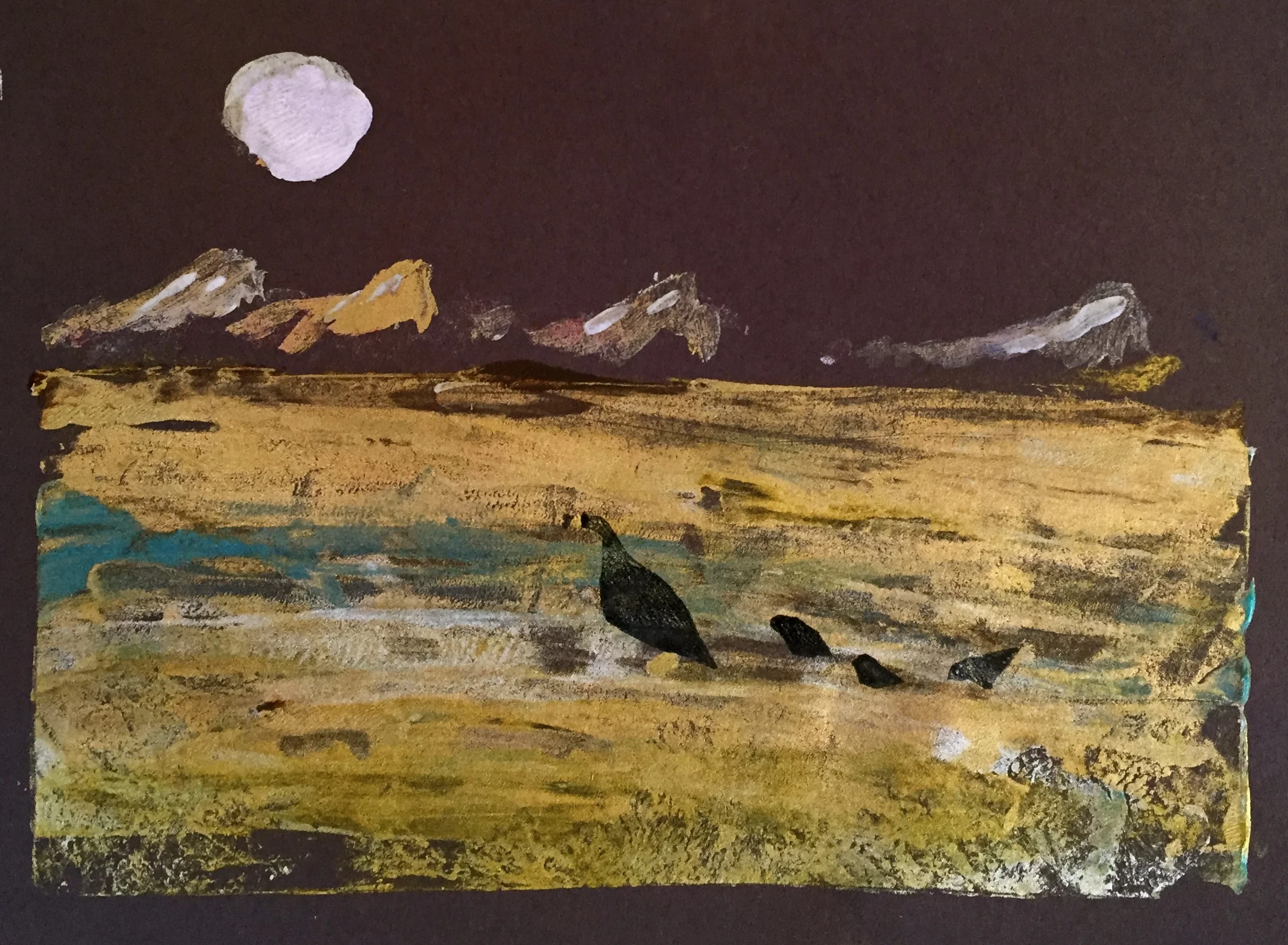
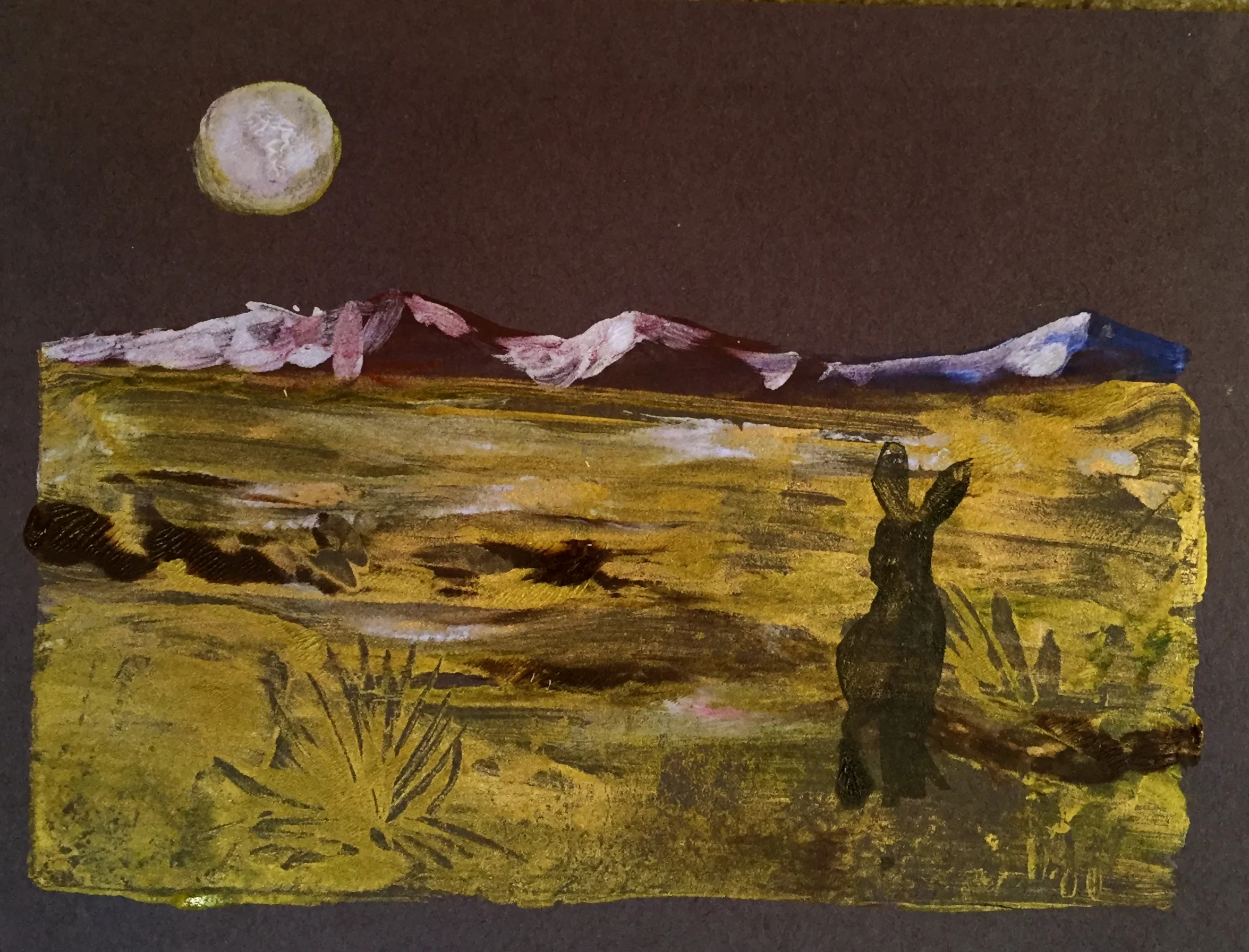
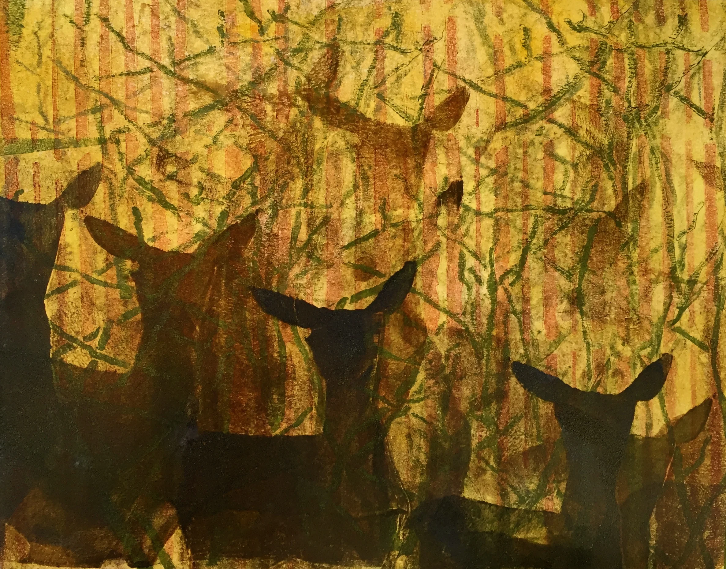
Monoprinting with a limited color pallete on gelatin plates.

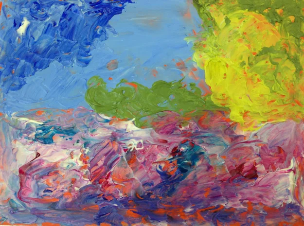
A few student examples of an exercise using a limited pallet using Golden OPEN Acrylic paint on gelatin plates. Students could pick one of each Red, Yellow, Blue and one Iridescent all in the OPEN format to create the colors needed for their desert landscapes. We printed on black Arches paper and a black stationary paper that I picked up at a craft store for wedding invitations.


Lessons Learned: make more art and blog about it.

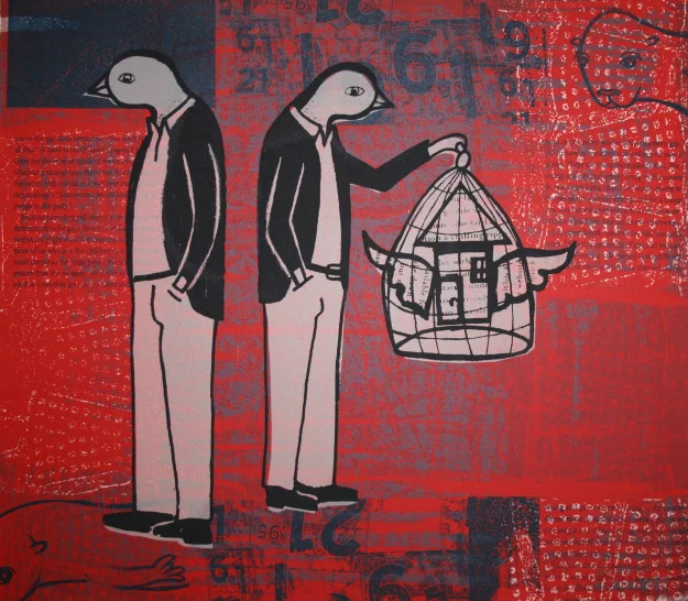
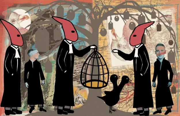
I guess really there are three lesson here: 1) working in themes is a thing I enjoy, so I should continue with that, 2) it pays to advertise, and 3) make more art and blog about it! Weired how the connections come and go in the universe…. someone just sent me an email, he randomly saw an advertisement I did for my bookmaking class here in SoCal and recognized the artwork on the flyer, i.e. the penguin dudes… (he's from the Bay area) as it turned out he bought my silkscreen print sometime back at a charity event (I donated one print, the edition size was just 12). The silkscreen employed  the same birdcage and penguin dudes that I used in my recent book. The print is sold out. It’s a 10-color screen print that measures 12 x 14 inches completed in 2007. Thanks Tom, you have good taste ...haha...now just come down to SoCal and take my bookmaking class...wink wink grin!

Caged, serigraph (silkscreen), 12 x 14 inches, edition of 12, 2007. Kevin Greeland

Caged, serigraph (silkscreen), 12 x 14 inches, edition of 12, 2007. Kevin Greeland

And here is another print from 2007 in a similar style also sold out; it was limited to an edition of 5. 

The Judgement of Brian Maxwell Butler. 11 x 17 inches, edition of 5, 2007. Kevin Greeland

The Judgement of Brian Maxwell Butler. 11 x 17 inches, edition of 5, 2007. Kevin Greeland

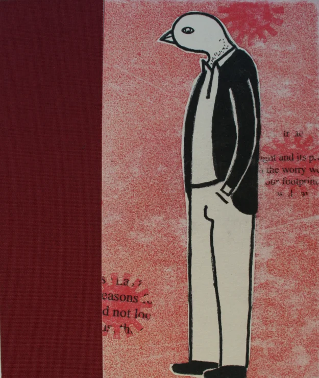
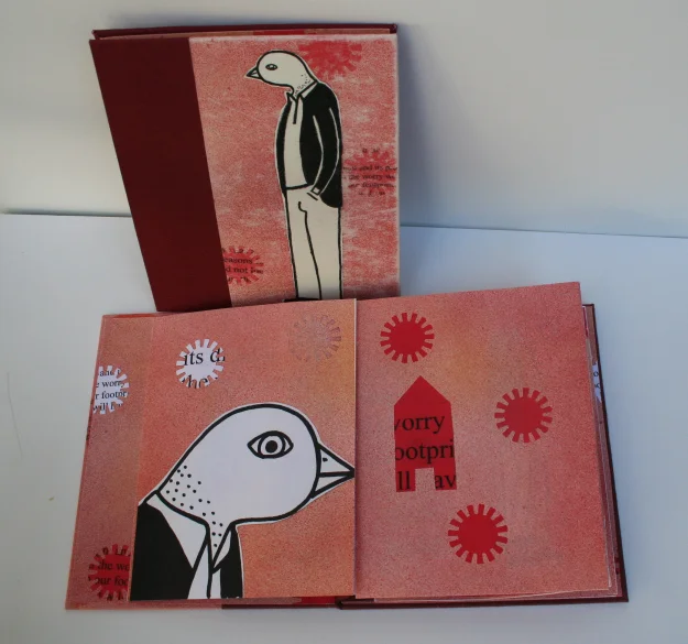
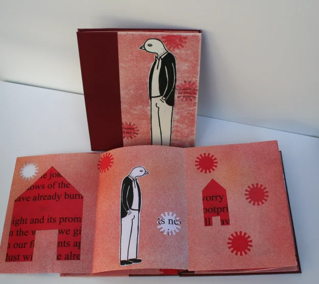
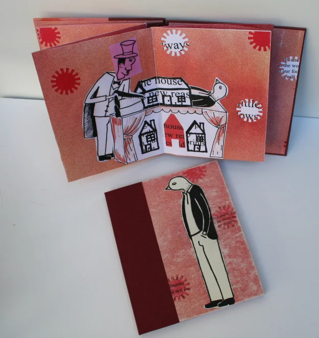
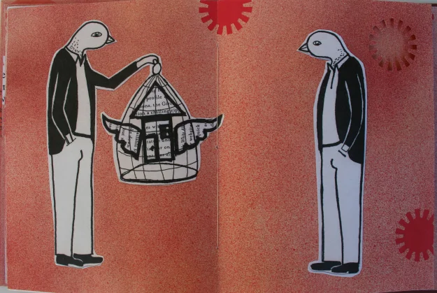
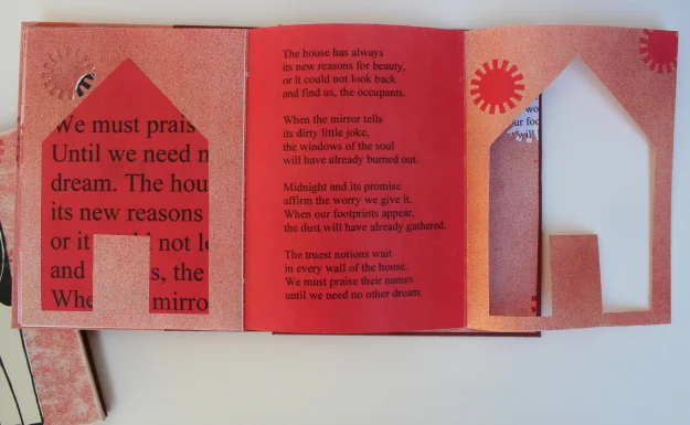
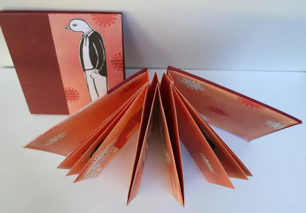
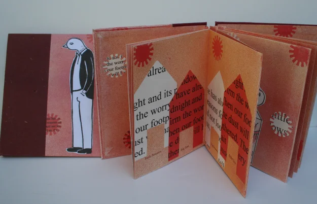
Below are a few photos of my penguin bird dude books with the house poem. Also you can keep up with all my class and workshop offerings under the calendar tab. Hope to see you in class!

Bookcover

Bookcover

These two books have hard covers with an accordion style spine and the pages are also a variation on the accordion style; the accordion pages are sewn to the accordion spine. The hard cover is a combination of artwork and book cloth glued over bookboard. The pages are a Somerset paper with various techniques from watercolor, pen & ink, and collage; the pages also have various cutouts and additional bi and tri folds.

Whimsical Birds in High Flow Fluorescent Pink

High Flow Acrylics on tinted Light Molding Paste

High Flow Acrylics on tinted Light Molding Paste

Whimsical Birds or drawing with Golden High Flow Acrylics. Patti Brady, Director of Working Artist Program at Golden Artist Colors, Inc., designed this project. The project was for the NAEA conference held in San Diego and designed to showcase High Flow Acrylics and using Molding Paste as ground to paint on. I thought it would also be a fun project for students new to painting, introducing them to the various options in viscosity.  A wonderful but simple exercise to get the creative juices flowing.

Painted with High Flow Acrylics in refillable markers on tinted Light Molding Paste.

Painted with High Flow Acrylics in refillable markers on tinted Light Molding Paste.

Golden High Flow Acrylics are designed for airbrushing, pen & ink, refillable makers, pouring, glazing and painting. The High Flows are high-intensity, flowing colors made with opaque and transparent pigments. They are formulated virtually clog-free utilizing 100% acrylic polymer emulsions and lightfast pigments, excluding the fluorescents.

Light Molding Paste and Fluid Indian Yellow Hue were mixed together to create the background and then applied with a palette knife to the painting boards (7 to 3 ratio for the mix).

Allow background to dry and then start painting.

Painted with a combination of refillable markers and brushes.

Painted with a combination of refillable markers and brushes.

There’s always one odd bird in the flock. LOL. A student accidentally painted on their crackle paste board, which was to be used for their pear painting, but it still works and looks equally as good!

Bird painted with High Flow Acrylics on Crackle Paste.

Bird painted with High Flow Acrylics on Crackle Paste.

If you would like to learn more about my clases check my calendar page for a class near you, also to find about these products please visit the following link:

Golden Artists Colors, Inc.       

Cutting the "I'm interested in" BS from artist statements.

I teach painting classes and in doing so, my goal for my students is to be successful painters. I see my task as sharing my experiences as an artist, sharing both my success and failures at painting, sharing my skills and knowledge. To move the person from being a student to “being” an artist—though this statement seems slightly bizarre, as if this state of “being an artist” can be “taught” — it’s really a set of skills I’m demonstrating and the “learning to be an artist” perhaps is a bit off topic here anyway…the subject at hand is artist statements.

Recently a student called me needing help, she had taken classes with me, on and off, for about a year. She had entered artwork into a show and the painting was selected for the exhibition, her elation was quickly diminished when they ask her to resubmit her artist statement. So she wanted my help....I thought how bad could it be? I asked her to email the statement and then we arranged to meet for coffee and do some editing. My elation for her success quickly waned as well, the dreaded artist statement…. my mind spun a thousand directions… my weakness was about to be exposed…. crafting an artist statement…. Ugh…….

But I remembered  two recent article and my weakness was now a strength as a point of interest…

The link will take to “a blade of grass” website, there you can read two fantastic articles, one by Steve Lambert and the other by Harrell Fletcher. Thought provoking for sure and you will definitely look at your artist statement a little differently.

Steve Lambert on cutting the “I am interested in” bullshit from artist statements. 

“Artists aren’t interested, they’re building reality.”

“You may wonder, why shouldn’t an artist be a little vague and leave some mystery to the description of their work? And so what if an artist uses language inaccurately – we all do it. (I admit, after years of effort I still have a difficult time avoiding “interested” in my speech.) And who cares if the language is a little imprecise, we’re talking about artists, not writers – what’s the harm? Because it changes the work we make. Saying you are merely interested in something is being non-committal. If I’m interested in something, I’m not necessarily taking a position on it, much less any action. But most artists are not just passively observing. They make work that challenges our view of everything – from shape and form to concepts and beliefs. Most artists don’t stop at being interested, they are truly changing the way we perceive, think, and act in the world – thus changing our very reality – in deliberate ways. To believe any less continues to falsely undermine and diminish the power of artists and art in our culture.” Steve Lambert.

Harrell Fletcher on Growing Dialogue: No Longer Interested – In Defense of Interest.

“Perhaps we are just dealing with semantics, but I don’t think the problem is the use of the word “interested” (though I agree it is overused) and even less in the activity of being interested. What I do totally agree with is the unfortunate condition that most artists seem to put themselves into (with great systemic help) of being disempowered and disengaged with real situations and issues. I feel, as I think Steve does too, that artists should become more engaged with making work that has direct function in society (which includes a wide variety of possibilities, but my own particular direction and interests has to do with site-specific, participatory, and educational practices) rather than focusing so dominantly on obscure, ineffective, theoretical, inaccessible, and strictly commodity based work.” Harrell Fletcher

...oh those delicious "Golden" pears!

Students from my Mixed Media Painting class were introduced to High Flow Acrylic paints, Fluid Acrylic paints, and a number of different grounds and pastes all made by Golden Artist Colors. The students painted on these various grounds and pastes to create some beautiful experiments using the pear as our subject.

Below are some examples of the “Golden” Pears created with both the High Flows and the Fluids on various grounds and pastes.

A pear painted on Crackle Paste.

A pear painted on Crackle Paste.

Pear painted on Glass Bead Gel, the board was first painted in Naples Yellow.

Pear painted on Glass Bead Gel, the board was first painted in Naples Yellow.

Pear painted on Absorbent Ground, aka “Liquid Watercolor Paper” and in this case tinted with fluid Quinacridone Nickel Azo Gold.

Pear painted on Absorbent Ground, aka “Liquid Watercolor Paper” and in this case tinted with fluid Quinacridone Nickel Azo Gold.

Pear painted on Coarse Molding Paste.

Pear painted on Coarse Molding Paste.

Pear painted on Acrylic Ground for Pastels. This was also tinted with one of my favorite colors Quinacridone Nickel Azo Gold.

Pear painted on Acrylic Ground for Pastels. This was also tinted with one of my favorite colors Quinacridone Nickel Azo Gold.

Pear painted on Fiber paste.

Pear painted on Fiber paste.

…and a two more examples of  students painting something other than pears on their Crackle Paste boards and Fiber Paste boards.
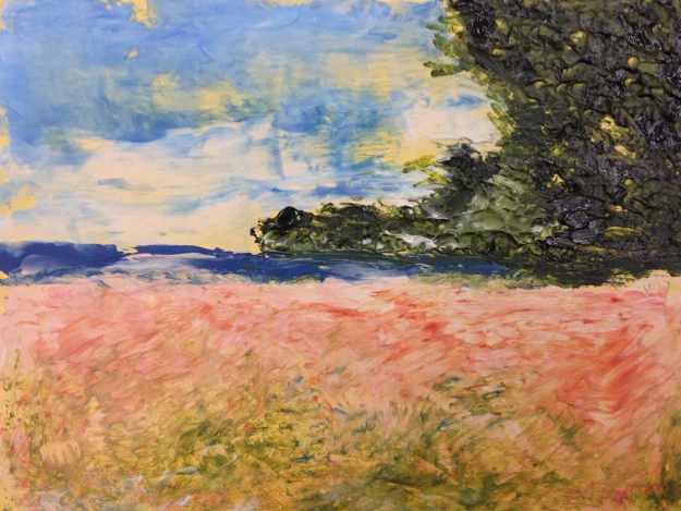
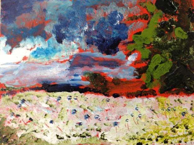
Alligators on Crackle Paste seems a natural fit and an abstract image on Fiber Paste.
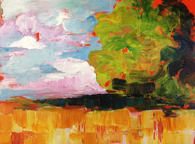
Alligators on Crackle Paste seems a natural fit and an abstract image on Fiber Paste.

…and a heart because we love Golden and Golden’s Crackle Paste.

…and a heart because we love Golden and Golden’s Crackle Paste.

If you would like to learn more my classes check my calendar page for a complete list of my classes. And to learn more about these Golden products please visit the following link:

Golden Artists Colors, Inc., visit: http://www.goldenpaints.com

I'm available ...

Are you interested in a free mini 2 hour crash course in Golden Acrylics or QoR Watercolors, or maybe Mixed Media approaches with Golden Acrylics? I'm available.... 

I'm available and can come to your organization to give the free 2 hour presentation, if you're an art club, art supply store, art guild or art museum feel free to contact me and schedule your event today!

The GOLDEN free Acrylic Lecture & Demonstration is a fun, fast-paced informative lecture covering a technical review of acrylics and their varied application possibilities. The lecture demo will present information on pigments, viscosities, gels, mediums and so much more.

Learn how acrylics can be used as grounds for other media, such as watercolor or colored pencil; get key information on color mixing, blending and controlling drying time; and see how gels can be used to modify paint properties or create unique textural surfaces. From traditional to contemporary to mixed media, acrylics are infinitely versatile.

Artists of all levels will come away from this lecture demo with fresh new insights to feed their creative expression. All participants will receive free product samples and a literature packet, including hand-painted color charts.

Please note that there are a limited number of Lecture Demos available and groups will need  a minimum of 20 to 30 students to be able to host a lecture demo. 


Golden Gels & Pastes

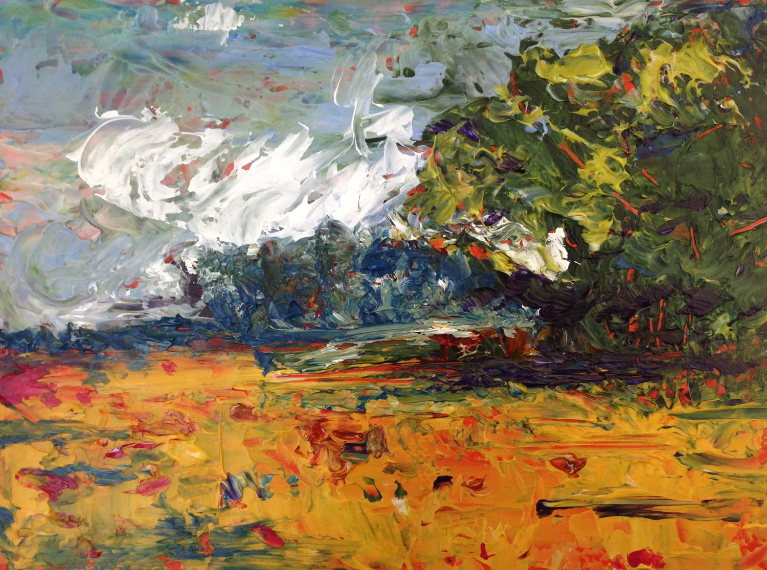
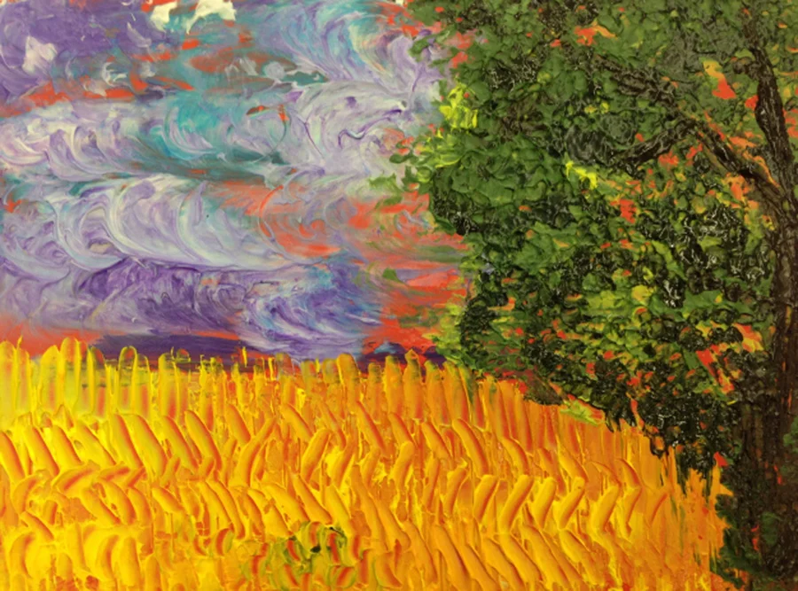
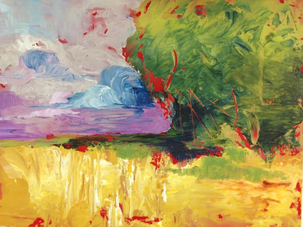
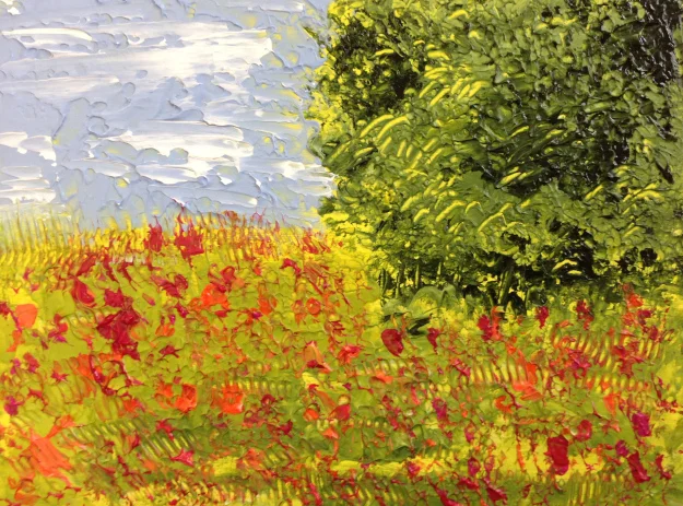
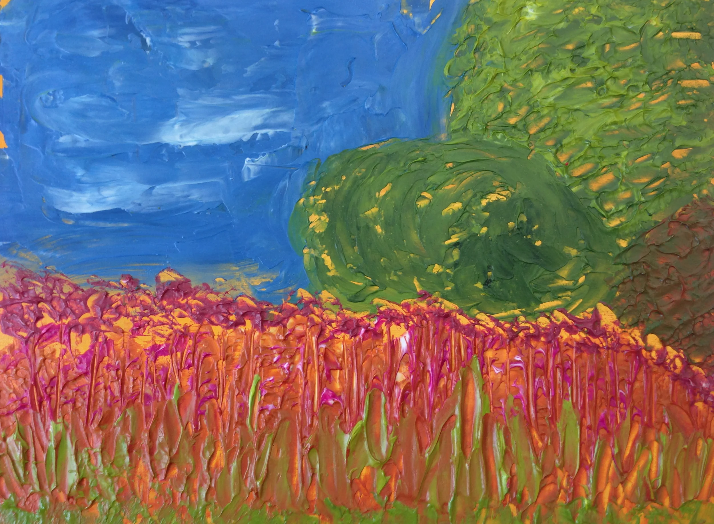
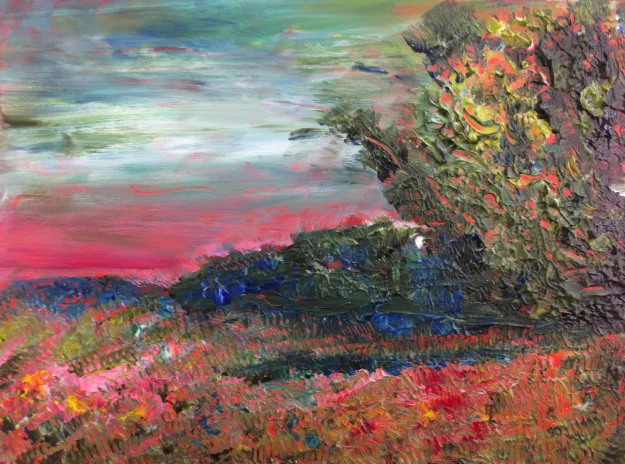
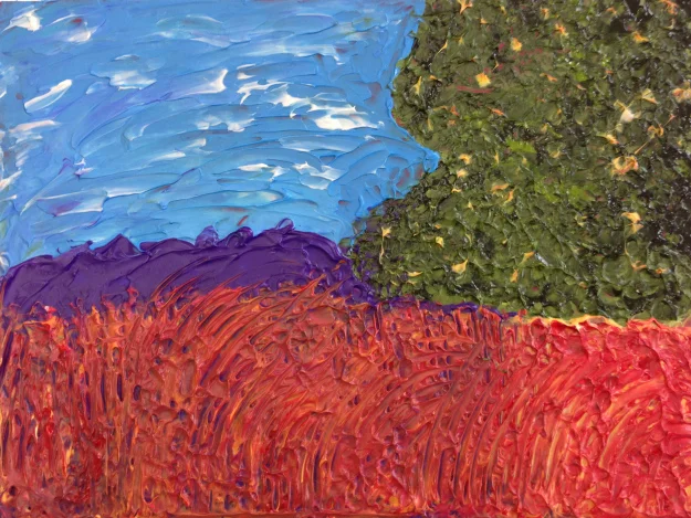
A quick post to highlight some of the artwork by my students in my 6-week painting course “Introduction to Mixed Media Painting.” This exercise dealt with Golden Gels and Pastes. Both gels and pates can be mixed with acrylic paint, in this case to create an impasto landscape.

Steps:

1) Underpaint your panel with one solid color, in class we used Naphthol Red Light or Naples Yellow – this acts as a tinted primer that will show through under the subsequent layers. In this class we used Golden Fluid Acrylics, but Heavybody would also work fine.

2) In class we used Golden Hard Molding Paste and or Heavy Gel (this could be Gloss or Matte)—Divide your Hard Molding Paste or Gel into several small piles and mix a different Fluid Acrylic Color with each one, mixing is easiest with a palette knife.

3) Using a palette knife to “block in” your paste mixture, then finesse the texture with the palette knife, brush, or other tool (like any of the Catalyst Blades & Wedges demonstrated in class).

4) Cover all areas of the board, but allow some of the underpainting to show through for an added effect.

5) Yippee you have an impasto landscape painting. Allow a few hours for drying.

Reflective Dwelling print wins an award!

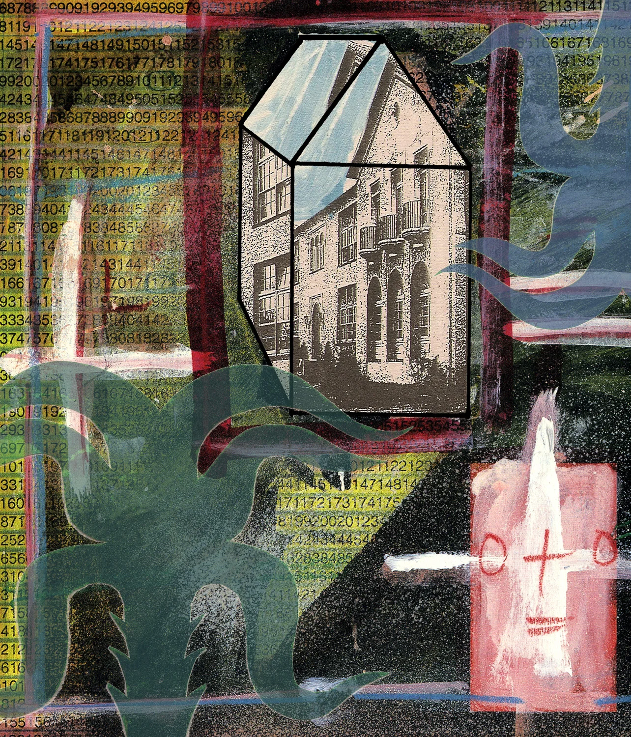
Reflective Dwelling, Digital Print.  32 x 28 inches unframed.

Reflective Dwelling, Digital Print.  32 x 28 inches unframed.

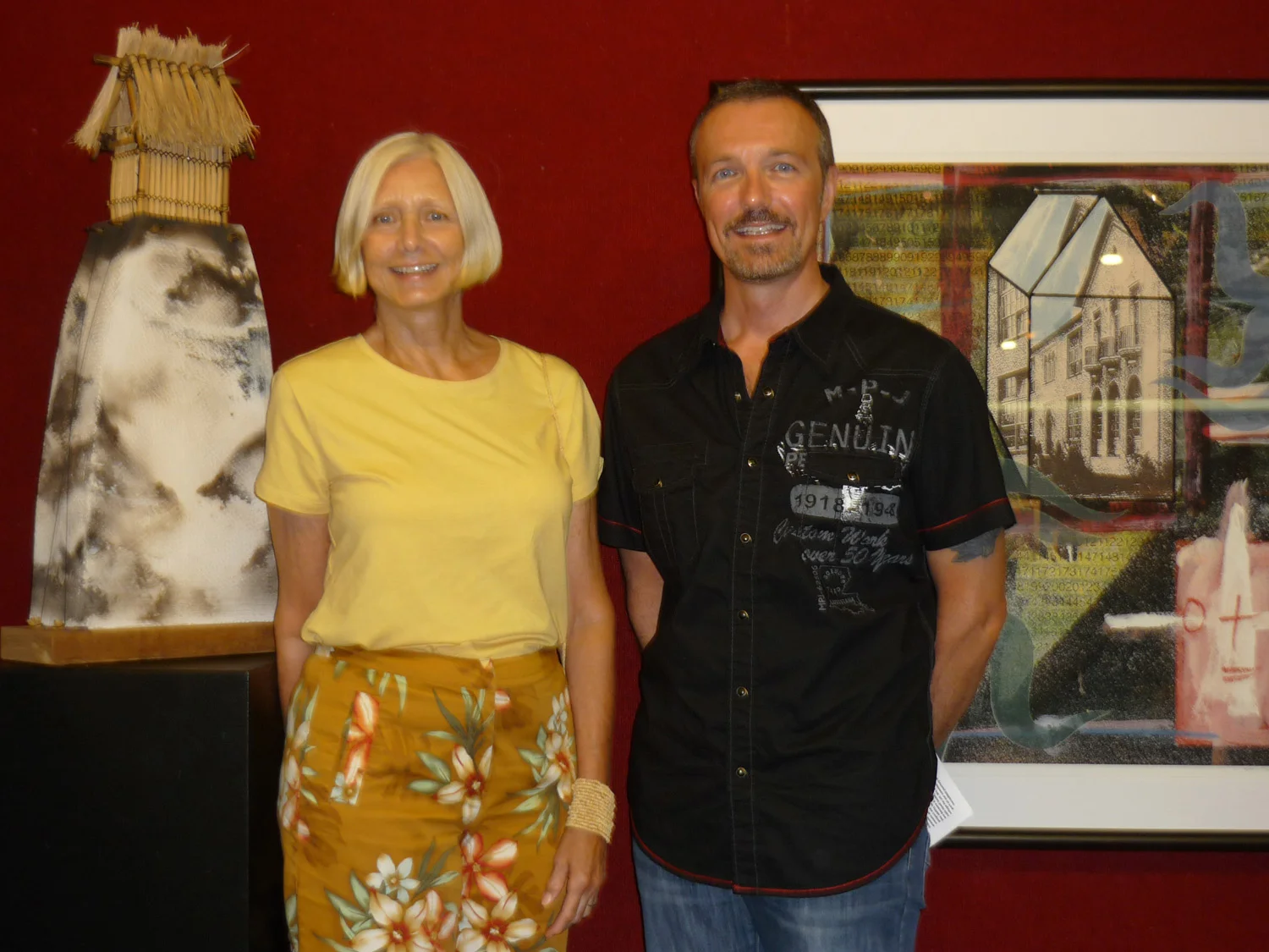
The print won and Honorable Mention Award at the Art Center Sarasota, FL. Refective Dwelling is a Psychogeographic Map of sorts, attempting to map a memory about specific events in time. It will also be on display this November at OBR Gallery in San Deigo, CA.

The Quilted Man-How he saw the New World

The Quilted Man-How he saw the New World, Acrylic on wood panel, 36 x 36 inches.Kevin Greeland

The Quilted Man-How he saw the New World, Acrylic on wood panel, 36 x 36 inches.

Kevin Greeland

One of my paintings won an award at the Art of Pride Show. The Art of Pride show was held outdoors in Balboa Park, San Diego. The painting is a play on identity,  masks and harlequin style colors (reminiscent of PA Dutch quilts) and also plays with the identity of both the subject and the artist. This pinting along with several others in the same style attempts to examine our identities and how we navigate the social arena in person or online, and in the apps of our phones, creating new avatars and new personas with every new encounter. This painting along with the others in the series are designed to have a touch of mystery – and display a preoccupation with the issues of identity, how our identities are in a constant state of change and flux—represented by the dimensional geometric shapes that compose the body. 

….in addition to the cash prize for third place I also received this fancy ribbon!

….in addition to the cash prize for third place I also received this fancy ribbon!